












































c l o u d s e c u r e

Color Palette

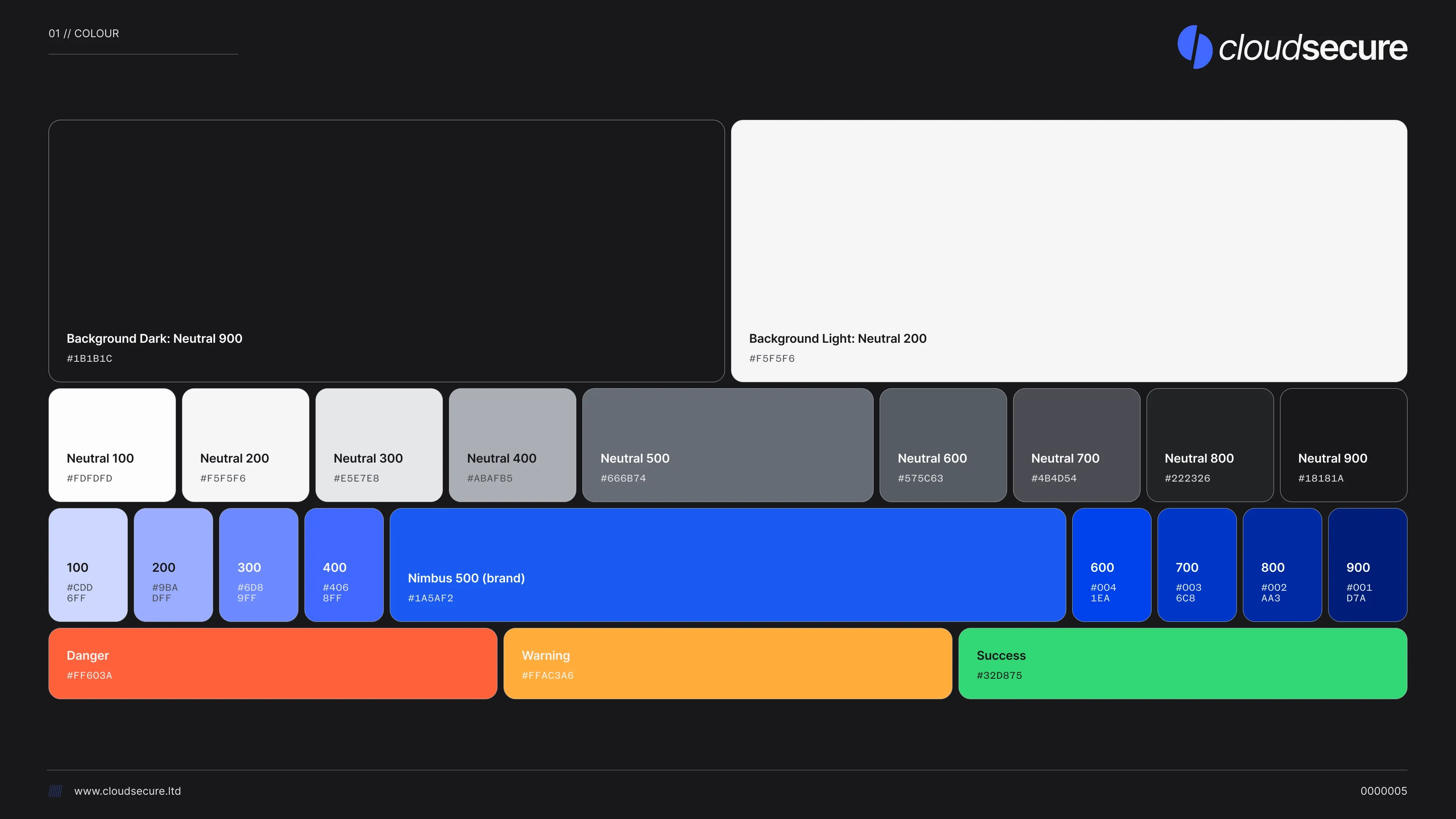
CloudSecure Complete Color Palette showing all primary blues, secondary grays, tertiary labels, and neutral backgrounds

Primary Color Palette

Nimbus Blue Scale

Our primary Nimbus palette spans from light tints ( #CDD6FF / Nimbus 100) through vibrant mid-tones to deep navy ( #001D7A / Nimbus 900). The scale includes: 100 ( #CDD6FF ), 200 ( #9BADFF ), 300 ( #6D89FF ), 400 ( #4068FF ), and continues through 600 ( #0041EA ), 700 ( #0036C8 ), 800 ( #002AA3 ), to 900 ( #001D7A ).

Nimbus 500 - Brand Color ( #1A5AF2 )

Nimbus 500 ( #1A5AF2 ) is our core brand color. This vibrant, electric blue appears in logos, primary buttons, and key interface elements. It provides excellent contrast on both light and dark backgrounds while maintaining the technical sophistication CloudSecure represents.

Usage

Nimbus colors dominate CloudSecure interfaces—navigation, headers, CTAs, and brand touchpoints. Use Nimbus 500 for primary actions and brand elements. Lighter shades (100-300) work for backgrounds and subtle accents, while darker shades (600-900) provide depth and hierarchy.

Neutrals

Neutral Gray Scale

Our neutral palette provides structural hierarchy from light ( #FDFDFD / Neutral 100) through mid-grays to near-black ( #18181A / Neutral 900). The scale: 100 ( #FDFDFD ), 200 ( #F5F5F6 ), 300 ( #E5E7E8 ), 400 ( #ABAFB5 ), 500 ( #666B74 ), 600 ( #575C63 ), 700 ( #4B4D54 ), 800 ( #222326 ), 900 ( #18181A ).

Background Surfaces (Application of Neutrals)

Background surfaces are specific use cases of the neutral palette: Background Dark uses Neutral 900 ( #1B1B1C ) for primary dark backgrounds in full-page layouts and main application surfaces. Background Light uses Neutral 200 ( #F5F5F6 ) for clean, bright surfaces in light-mode interfaces and content areas.

Usage

Neutrals create depth and organization without competing with primary blues. Use 100-300 for light backgrounds and surfaces, 400-600 for borders and dividers, and 700-900 for dark backgrounds, text, and emphasis. The dual-background system (Neutral 900 for dark mode, Neutral 200 for light mode) supports both interface modes while maintaining WCAG contrast requirements with their respective text colors.

Status Colors

Semantic Feedback

Status colors provide immediate visual feedback: Danger ( #FF603A ) for errors and destructive actions, Warning ( #FFAC3A ) for cautions and alerts, and Success ( #32D875 ) for confirmations and completed actions.

Usage Context

Apply status colors consistently across notifications, form validation, alerts, and action feedback. These colors are universally recognizable and meet accessibility standards for color-blind users when paired with appropriate icons and text.

Typography

Primary Typeface

Inter Variable

Serves as CloudSecure's primary typeface across all digital applications. This variable font provides exceptional screen readability while offering comprehensive weight options (400-600) for establishing clear typographic hierarchy without loading multiple font files.

Type Scale

Headlines use text-3xl (1.875rem/30px) through text-6xl (3.75rem/60px) with font-semibold (600) or font-medium (500). Body text uses text-base through text-lg with font-normal (400). Small text and labels use text-sm and text-medium for UI elements.

Implementation

Inter Variable is defined as --font-sans in our design system and applied globally. The variable font format ensures optimal loading performance while providing smooth weight interpolation for precise typographic control.

Secondary Typeface

For code samples, technical specifications, and monospace requirements, CloudSecure uses system monospace fonts to maintain consistency with developer tools and terminal environments. This pragmatic approach ensures code blocks integrate naturally with technical documentation.

Usage Context: Reserve monospace typography for code snippets, API references, command-line examples, and technical specifications where fixed-width characters aid comprehension. Never use monospace for body copy or marketing materials.

Google Alternatives

Inter is available as a Google Font when variable font support is unavailable or in environments requiring CDN-hosted fonts. Use Google Fonts Inter with weights 400 (Regular), 500 (Medium), and 600 (Semibold) to approximate our variable font implementation.

Fallback Stack: When Inter is unavailable, the system falls back to system-ui, sans-serif. This ensures readable typography even in restrictive environments while maintaining professional presentation appropriate for enterprise communications.